UX Designer

Website Optimisation to Improve User Engagement
Redesigning the Homepage and Information Architecture based on user research
Médecins Sans Frontières Australia
Research - Design - Test - Iterate
Sector
Non-profit, international and independent medical humanitarian organisation
Challenge
Médecins Sans Frontières Australia's (MSFA) website needs to be redesigned to keep up with their brand's shift to an engagement culture. The redesign includes building a more intuitive information architecture and developing a homepage that inspires MSF’s mission hence increasing donations. This project is part of the UX Accelerator Program with PeakXD.
My Role
User Research, Analysis, Design, Usability Testing
Why was the old Homepage inadequate?


Research Data Analysis & Insights

To answer this question, I started with a contextual 1-1 Zoom interview with an MSFA supporter to gain a deeper understanding of their motivations, frustrations and needs.
Next, I analysed research data contributed by other researchers on the UX Accelerator program and organised the data using an Affinity Diagram to identify further user needs.
My research revealed that supporters wanted transparency and handy information on donation usage and how additional amounts can help. This was not available on MSFA's Homepage.

User Journey Map & Persona
Understanding MFSA strategic goal to better engage with their audience, I created a user journey map and persona to identify opportunities for user engagement. These deliverables help to keep the end user in the forefront of my design process.

My goal for the User Journey Map was to identify opportunities to enhance user engagement.

My goal for the User Persona was to embody the qualitative data into a representative ‘typical’ supporter of MSFA.
Competitor Analysis

I conducted a competitor analysis to better understand the industry and for design inspiration.
I found that most of the competitor websites provided fund utilisation information and communicated a sense of partnership with their audience on their Homepage.
Understand How Users Sort Data
I conducted an open remote card sorting exercise (using Optimal Workshop) to understand how users would group the site content. From the 234 categories created, I identified 5 key themes to inform my Information Architecture design:
-
Donations
-
MSFA News and Projects
-
Application (for working in the field)
-
How MSFA responds to crisis
-
Resources for schools/teachers

Low-Fidelity Wireframes
I created low-fidelity wireframe to map out the Homepage structure and strategy. I kept one row of 'latest stories' as MSFA Homepage heat-map revealed low click rates. As my client was interested in getting feedback on their photos, I included greyscale photos to avoid distracting participants during usability testing.

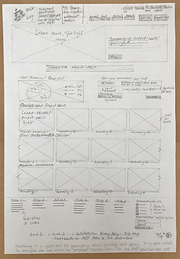


Information Architecture Design
I designed a new Information Architecture using the card sort results and ideas from competitor analysis. Cross-links (in dotted blue lines) were added for users' convenience.

Learning
In retrospect, I felt that a collaborative workshop with MSFA to decide relevant site content would have been valuable in redesigning their Information Architecture. Given limited access to MSFA, I proceeded with the assumption that all site content is relevant.
Homepage Moderated Usability Test
I recruited 4 participants who supported charities to test the Homepage using Optimal Workshop (Chalkmark). I gave participants 10 tasks to uncover their challenges and delights about the design.
Top insights from Chalkmark tasks and questions asked post-task completion:
-
MSF's purpose and mission statement were overlooked
-
The financial snapshot image was missed when looking for donations utilisation (refer test result below)
-
Participants wanted to "hear from doctors and patients" before they donate
-
Participants "love the 'Togetherness' message"
Feedback on Photos: As expected, there were mixed feedback on the photos. Comments ranged from "too artistic" to "poverty porn". This feedback was relayed to the client during the showcase.

Information Architecture Tree Test
The Information Architecture was tested remotely using Optimal Workshop (Treejack) which provided valuable insights for iterating the IA design given the absence of input from the client.

Learning
I found the usability session extremely valuable, especially the post-test questionnaires, in providing insights on both the Homepage and Information Architecture design. However, I felt my energy level dipped when it came to the 4th participant of the day given each session ran for 45 minutes.
In future, I will keep the maximum number of participants to 3 per day of usability testing to maintain my level of focus.
Iterated Homepage and Information Architecture

Key updates made to the Homepage design were:
-
Displayed MSF's purpose and mission statement at the top with bigger fonts
-
Added a 'Message from the field' section with video clips from doctors and patients
-
Donations usage displayed as percentages with larger fonts and added a 'Find out more' link to an existing MSFA page with the fund used details
Updates made to the Information Architecture:

Outcome
I presented to the client and some of their feedback are:
-
"I love a lot of the things you have to say there"
-
"The message of 'Togetherness' speaks to the positioning of our brand"
-
"... your point that the most prominent element on our Homepage is what MSF stands for... this speaks to the work that we are doing internally"
-
It was "helpful to highlight" the 'Messages from the field' videos and 'Current emergencies' need to be more visible as "we can easily add this to our Homepage"
Additional | Online Application Form Review
I conducted a review of MSFA's online Application form against interaction design and usability guidelines and identified 13 key usability issues. A review report with my findings and recommended changes were submitted to MSFA. A click-through low fidelity prototype can be viewed here.

Conclusion & Retrospect
I enjoyed the journey of this project as it gave me exposure to a different industry and I was able to contribute to a good cause. Also, I learnt the importance of doing my research, analysis and design ahead of usability testing to reap greater benefit from it. The opportunity to showcase and share my designs with my client was greatly rewarding.
My final retrospect is that I would have liked to conduct another usability test on my iterated designs to ensure that they have met MSFA's project objectives.